

TradingView updates Lightweight Charts
TradingView has updated Lightweight Charts.
One of the most important updates is fancy canvas, moving from v1.0.1 to v2.1.0.
TradingView has finally renewed its rendering architecture to support pixel-perfect rendering in modern browsers. The new box measurement called devicePixelContentBox started to appear recently in some browser implementations. It enables requesting HTML canvas dimensions in physical pixels, that, in turn, allows to perform “true” pixel-perfect rendering at any page zoom or pixel density, without wild-guess approaches to determine canvas bitmap’ size.
And the new release of fancy-canvas adopts this new approach, introducing some abstractions to support the idea.
The updated Lightweight Charts introduce the possibility to draw curved lines using Beziers curves.
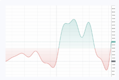
The developers have also added the possibility of customizing the colors for different parts of an area series.
Also the chart gets the proper size at initialization, but also every time it’s resized. Such behavior could be encountered when rotating a phone or tablet or when resizing the chart on a website.
There are some major fixes:
- Incorrect price line labels formatting
When setting the price scale mode to anything other than ‘Normal’, the price for PriceLine wasn’t properly calculated. That’s all in the past now!
- Animation glitches
On some occasions, when a user was trying to reset the time scale while another action was taking place, some nasty glitches were noticeable on the chart.
Let’s note that TradingView has recently released several updates to the financials tab located on the symbol page. If you’re an investor interested in Tesla, Apple or any other company, you can perform deep research by using TradingView’s company financial pages.
TradingView has updated the Overview page to include more data and visuals. Investors can study important trends in earnings, cash flow, profit margin, and more.
The Statements, Statistics, Dividends, and Earnings sections have also been updated with helpful features.
- Each financial line item is now more neatly positioned in columns and rows, with drop-down arrows to go deeper into a subsection, and it can be seen by quarterly or annual data.
- The tab now shows year-over-year (YoY) growth.
- Investors can create their own custom bar charts at the top of the page as well by selecting the financial metrics they want to include – just click metric you want to include and the bar chart at the top will do the rest.